The logo gets the meeting, the type does the work
When a brand project kicks off, the conversation almost always orbits the logo. It is the thing everyone can picture, the thing the founder has an opinion about, the thing that ends up on the slide. And yet, in the life of a brand after launch, the logo is one of the least-used assets you own. Most of what a customer reads from you is set in your body typeface: the website, the emails, the contracts, the captions, the error messages. Type is doing the heavy lifting, quietly, in every sentence.
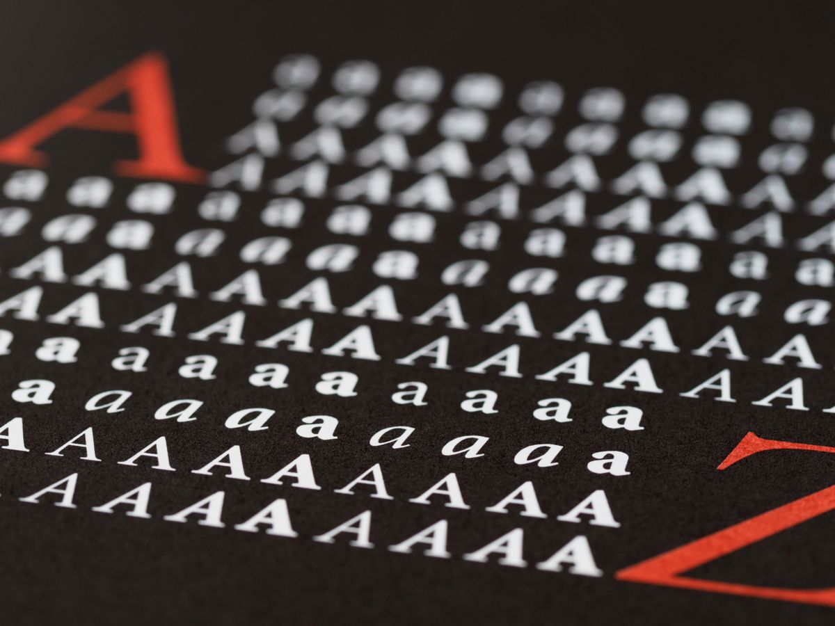
This is the half of identity that goes unnoticed precisely because it works at the level of feeling. A reader does not consciously register that your text is set in a warm humanist sans rather than a cold geometric one. They simply come away thinking you seem approachable, or precise, or expensive. The typeface is delivering a verdict about your brand before a single word has been understood.
Voice lives in the details
We talk a lot about brand voice as a writing problem — tone, vocabulary, rhythm. But voice is also a typographic problem. The same sentence reads differently in a tight, confident grotesque than it does in a generous serif with open counters. Letter spacing, line height and the contrast of a typeface all shape how the words land. A brand that wants to sound considered cannot set its considered words in a typeface that feels rushed.
This is why we choose type alongside the words, not after them. The decisions are entangled. The way a paragraph breathes on the page is part of what the paragraph says.
A brand is read far more often than it is looked at. The typeface is the voice your audience actually hears.
Restraint is a feature, not a compromise
The temptation in any identity is to reach for a distinctive display face and let it carry the personality. Sometimes that is right. More often, the durable choice is a quieter one. A typeface you will read ten thousand times needs to disappear into legibility, not announce itself on every line. We tend to pair one expressive voice for headlines with a steady, unfussy workhorse for everything else — and then we spend most of our effort on the workhorse, because that is where the brand actually lives.
Restraint also protects the system over time. A flamboyant typeface dates quickly and constrains the people who inherit it. A well-chosen, sober family ages slowly and gives a team room to be expressive through layout, colour and image without fighting the type.
Treat type as infrastructure
Our last point is a practical one. Typeface licensing, web-font performance and a clear set of typographic tokens are not afterthoughts to be sorted out by an engineer the night before launch. They are infrastructure. A brand whose type renders slowly, falls back to the wrong fallback, or breaks across languages is a brand quietly undermining its own credibility. We treat the typographic stack with the same seriousness as the visual one, because the words are the brand most of the time — and the words deserve a system built to hold them.